Project Description
It’s funny how one trip can change so much. Sitting here, about 1 week since we got back Greece, all I can think is how excited we are for our next adventure. Previous to this trip, it had been almost 5 months since we had taken an international trip. I can only assume that for most people that’s plenty of time, but for us it was like trying to hold our breaths for 5 months. We need trips like a fish needs water. It’s a part of who we are now, and it makes for an exciting life.
When we returned from the trip, we had a renewed vigor and excitement to grow the business. We had made friends, explored most of the island, and more importantly, found a little piece of who we were as a business and as a couple. We had always intended for the old logo to be a simple placeholder for an eventual redesign, and when we got home we both realized that it was time to start redesigning the business. We were starting with this:

When we first designed this, we basically were looking for any representation of travel. We settled on a globe, and the typewriter font to signify a journalistic outlook on the business.
We wanted to take more interest in meditation and yoga, and we wanted our business and logo to reflect that. We also wanted something modern and sleek, which reflected how we felt about the business. We didn’t have a color palette which made it difficult to start designing, but after looking at other travel brands, we decided to take some creative liberties with some of the shapes we saw. That led us to our first 3 logos:

After looking at the suitcase, I fell in love the with general shape of it. I however did not like the airplane because I figured it was overdone. I do however love the place pins that you see in so many maps. So after playing with the shapes a little more I arrived at these two options.

I loved the contrast between the light and dark on the lower option, as well as the Yin and Yang which to us represented the Zen that we found in traveling so that became our favorite.

I still was not sure about the color so I decided to get a few more options. While working on the colors, I realized I liked the idea of a map showing through the lighter side of the logo. Below you can see two of the ways I placed maps in the background of the image.

After playing with it, we settled on the one below. but I was still disappointed with the colors.

Here we tried playing with the colors and highlighting the map. I personally loved this, but it was a little busy, and we wanted something simpler and more modern.

We returned to the simpler uncolored map style, then used a website called COOLORS.CO to generate different color palettes and see what options we liked.

Our love of blue shone through, and we decided we wanted something a little brighter, to stand out. We settled on the second choice.

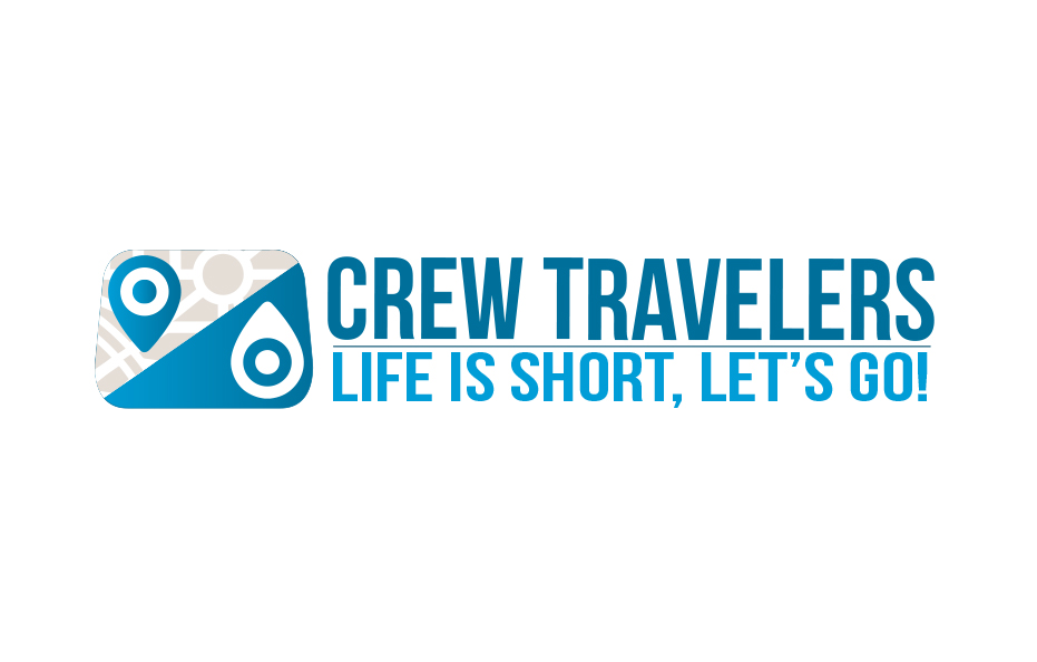
Which leads us now to our current logo! The process took a full day of back and forth on ideas and playing with different options. We hope that it does a better job of representing our company and that you enjoy seeing it all over the world! Along with a new logo comes a new mission statement: “Crew Travelers is a platform for tours that accommodate groups of adventurous, open-minded, big-hearted people who are willing to get out of their comfort zone, make a positive impact and immerse themselves in the local community.” Thanks for reading this, and we hope we see you on our next trip!